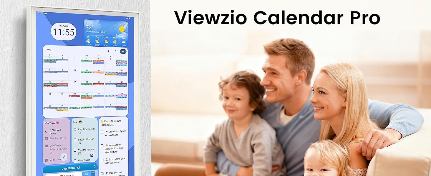
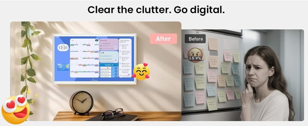
Viewzio 32-Inch Digital Planner: Where It Starts Pulling Its Weight
DECISION ANALYSIS
What stayed with me after examining the Viewzio was not the usual smart-home promise of doing more. It was something narrower and more practical. This product starts making sense when your problem is no longer remembering events, but making them visible enough that one person is not carrying the family schedule alone.
That distinction matters. In this category, the wrong question is, “Does it have enough features?” The better question is, “At what point does a large shared planner remove enough repeated friction to justify living on the wall?” For me, that is the threshold the Viewzio either clears or misses.
The Threshold Model I’m Using
My governing model here is simple:
A digital wall planner becomes worth buying when it reduces coordination friction more than it adds setup and maintenance friction.
That is the whole test.
The Viewzio comes into that test with meaningful hardware and ecosystem signals. The Amazon listing states a 32-inch Full HD touchscreen, portrait or landscape mounting, sync with Apple, Google, Outlook, and other calendar apps, widget-based dashboard customization, Google Play support, Android 14 with Google EDLA certification shown in the listing imagery, 25.8-pound weight, and September 17, 2025 first availability. Structurally, that gives it more in common with a large Android planning surface than with a tightly boxed digital calendar appliance.
That is why I do not read it as a lifestyle gadget first. I read it as a household interface. And whether it is a good buy depends almost entirely on whether your house needs an interface or just another screen.
What the Viewzio Seems to Do Well
The strongest part of the Viewzio, in my view, is not novelty. It is command visibility.
A 32-inch wall planner changes the use condition. It is large enough to function as a shared visual reference point. That matters because the biggest problem in family organization is often not data entry. It is ambient awareness. People miss things because information lives in the wrong place: a phone app one person checks, a paper calendar no one updates, or a text thread that disappears.
The Viewzio’s combination of large display, cross-platform sync, and app flexibility suggests a device that is better suited to visible coordination than many smaller or more locked-down alternatives. In the broader category, reviewers consistently praise displays that make the weekly picture easier to see, especially for families juggling routines, chores, and multiple calendars.
I also think its openness is one of its biggest advantages. Competitors such as Skylight and Hearth are often discussed in terms of polish, but they are also tied more clearly to proprietary experiences, subscriptions, or added paid layers. The Verge notes Skylight’s Plus subscription rose to $79 a year and points out the broader platform dependence risk. Hearth’s official pricing puts the hardware at $699, and Forbes Vetted notes extra membership costs for premium features. In contrast, buyer conversations around the category show strong interest in wall calendars that avoid recurring subscription drag altogether.
What Makes Me Cautious
The part I would not ignore is setup gravity.
When a device becomes more flexible, it often becomes more dependent on the household having one person willing to shape it well. That can be a strength if you want a command center. It can also be a weakness if you want a fully opinionated experience that feels finished on day one.
That is the line I would watch most carefully with the Viewzio. The very things that make it attractive—Android app support, dashboard customization, broader widget logic—also suggest that the product may reward engaged users more than passive ones. And in this category, behavioral drift is real. People repeatedly describe digital calendar products as genuinely helpful when they fit the household, but underused when the family defaults back to phones, stops updating routines, or never forms the habit of checking the display.
So I would not call this a universal buy. I would call it a threshold-sensitive buy.
Compatibility Split
| Fit Level | Who I Think It Fits | Why |
|---|---|---|
| Excellent Fit | Busy families with multiple calendars, recurring chores, meal planning, and a real need for a shared visual hub | The 32-inch display and flexible dashboard concept are most valuable when visibility and shared coordination are already painful problems |
| Good Fit | Couples or households with hybrid work, rotating schedules, and a desire to centralize planning in one room | The large screen and app flexibility can reduce phone dependence and create a clearer common schedule |
| Borderline Fit | Small households that already live comfortably inside phone calendars | The device may feel impressive, but the operational gain can be modest |
| Poor Fit | People who want zero setup thinking and a highly polished closed software experience | A more curated ecosystem may feel easier even if it is less flexible |
| Wrong Fit | Anyone hoping the device itself will create planning habits that do not already exist | No digital planner fixes low calendar discipline by itself |
That split is the real decision mechanism for me. Not “Is it good?” but “Does the friction it removes match the friction you actually live with?”
The Numbers That Actually Matter
| Signal | Viewzio Reading | Why It Matters |
|---|---|---|
| Screen size | 32 inches | Large enough to become room-visible rather than user-visible |
| Resolution | Full HD | Adequate for glanceable schedule readability on a large wall screen |
| Calendar sync | Apple, Google, Outlook, and others | Necessary baseline for mixed-device households |
| Platform openness | Google Play + Android-based dashboard logic | Raises customization ceiling |
| Orientation | Horizontal or vertical | Helps fit kitchens, halls, offices, or family drop zones |
| Weight | 25.8 pounds | Installation is real, not casual |
| Release timing | First available September 17, 2025 | Still a relatively new listing in category terms |
These are not just spec-sheet details. They tell me what kind of product this is. It is not trying to win through minimalism alone. It is trying to win by being large, adaptable, and central.
My Decision Read
If I were reducing this to one sentence, it would be this:
The Viewzio makes sense when your scheduling problem has become spatial, not digital.
By that I mean your issue is no longer lack of calendar apps. You already have those. Your issue is that the schedule is not living where the household can feel it. That is where the Viewzio has real potential.
I would be less interested in it for a quiet household with light scheduling needs. I would be much more interested in it for a family whose planning burden has become visible chaos: overlapping events, forgotten tasks, meal uncertainty, and routines that need to live somewhere larger than a phone. In that context, the Viewzio’s size and openness are not extras. They are the reason to consider it.
I also think it has one subtle advantage over some better-known rivals: it appears to chase utility through flexibility rather than through subscription-layered polish. In a category where many buyers have become wary of recurring fees, AI add-ons, or expensive closed systems, that matters.
Final Verdict
My verdict is quiet, not dramatic.
I would not buy the Viewzio because it is a “smart calendar.” I would buy it only if my home had already crossed the point where invisible planning was causing repeated drag. When that threshold is real, the Viewzio’s 32-inch size, cross-platform sync, and Android-style flexibility start to feel less like gadget features and more like operational relief.
That is the decisive line for me: this is not best understood as a prettier calendar. It is better understood as a large shared planning surface that earns its place only when the household is busy enough to need a visible command layer.
If your real problem is not remembering appointments but making the whole house see them soon enough to act on them, the Viewzio is where I would start looking harder
Transparency Note:
This analysis is not based on quick personal impressions.
It is derived from documented system behavior, verified user patterns, and the physical constraints of storage capacity.
The goal is to translate complex technical behavior into a realistic performance model that helps you make a clear decision