When a Digital Wall Planner Actually Becomes Useful
ANALYSIS FRAMEWORK
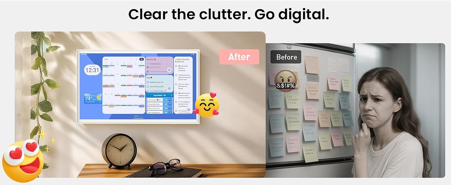
The first thing I noticed while studying this category is that most digital wall planners do not fail because the idea is weak. They fail because they never cross the threshold where people naturally use them. They look organized, they photograph well, and they promise relief, but in real homes the deciding question is simpler: does this screen reduce repeated household friction, or does it become one more object that only one person updates?
That is the threshold I care about here. Not whether a screen can show a calendar. Almost any screen can. What matters is whether it becomes visible enough, shared enough, and friction-light enough to move scheduling out of one person’s head and into the room itself. That is where this category becomes interesting. Reviewers and users keep circling the same real-world issue: these displays help most when they make the household schedule easier to see at a glance, but they lose force when the screen turns into a novelty item, a subscription burden, or just a larger version of what was already on everyone’s phone.
The Usefulness Threshold I Keep Coming Back To
For a digital planner to feel necessary rather than decorative, I think it has to clear four conditions at the same time.
First, it has to be readable from normal household distance. If the screen does not command attention from across a kitchen, hallway, or family work zone, it does not become shared infrastructure. It stays personal.
Second, it has to reduce update resistance. If the household still falls back to phones, text threads, sticky notes, or mental reminders, the planner has not changed behavior. It has only added another layer.
Third, it has to support the real texture of life, not just a monthly grid. That means chores, meal planning, repeating routines, changing events, and more than one calendar ecosystem.
Fourth, it has to survive behavioral drift. The category’s hidden problem is not setup. It is week six. That is when the novelty wears off, when one parent becomes the only updater again, and when the product either proves it is a command surface or quietly becomes wall décor. Owners and reviewers repeatedly describe this exact divide: some households feel immediately less chaotic, while others discover that the device adds little beyond what their phones already do.
Why the Viewzio Caught My Attention
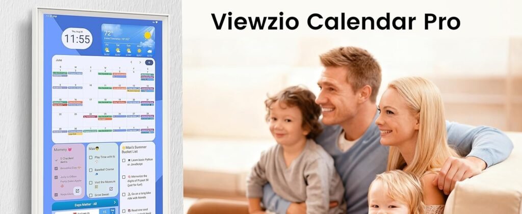
What made me stop on the Viewzio is that it is not really positioning itself as a locked family calendar first. It is positioning itself more like a large-format Android planning surface. On the Amazon listing, the core promise is a 32-inch Full HD touchscreen with horizontal or vertical mounting, real-time sync with Apple, Google, Outlook, and other calendar apps, customizable widgets, Google Play access, and an Android-based dashboard concept.
Even the product imagery and listing language lean toward drag-and-drop widgets, meal planning, chores, and broader household dashboard behavior rather than a single-purpose calendar frame. Amazon’s listing also shows Google EDLA certification powered by Android 14, a 25.8-pound device weight, and a first-available date of September 17, 2025.
That matters because this product is trying to clear the category’s hardest threshold in a different way. Instead of saying, “Here is a polished family organizer with a tight software box,” it seems to say, “Here is a large shared screen that can become the planning surface your house actually needs.” And in this category, that difference is not small. Dedicated family displays such as Skylight and Hearth are often praised for simplicity and polish, but reviewers also note their pricing, subscriptions, AI add-ons, or feature limitations. At the same time, category discussions show an opposite demand from buyers who want a wall calendar without recurring fees and with more open-ended flexibility.
The Hidden Variable Most People Miss
The hidden variable is not “features.” It is household compliance.
I have come to think of this as display compliance: the degree to which a screen gets checked without prompting. A family planner only becomes useful when the house starts naturally orbiting it. Children notice it. A spouse glances at it in passing. The weekly plan becomes visible before anyone opens an app. If that does not happen, the device may still be technically capable, but functionally it has not crossed the threshold.
This is why size matters here more than marketers usually admit. A 32-inch display has a different social presence than a small countertop screen. It can stop being a device and start becoming a room reference point. That does not guarantee success, but it gives the Viewzio a real structural advantage in the exact place many digital planners fail: they remain too easy to ignore. The category evidence supports that bigger, more visible displays can help a household share the load more effectively, especially when multiple schedules, chores, and routines are involved.
Where the Threshold Breaks
I would not frame this category as “digital planner versus paper.” That is too shallow.
The real break happens here:
| Threshold Factor | What Failure Looks Like | What Success Looks Like |
|---|---|---|
| Visibility | People forget the screen exists | The screen becomes the place everyone checks |
| Shared access | One person manages everything | Multiple people reference and update it |
| Routine range | It only shows appointments | It supports chores, meals, reminders, and recurring life |
| Drift resistance | Usage fades after setup week | The screen keeps earning glances over time |
| Flexibility | The system forces one style of planning | The dashboard adapts to the household’s actual rhythm |
The Viewzio looks strongest where flexibility and visibility matter most. A 32-inch FHD touchscreen, app-store support, multi-calendar sync, and drag-and-drop widget logic all push it toward command-center territory rather than simple display territory. But that also creates the central tension of the product: flexibility raises potential, yet it can also raise setup burden. In this category, that tradeoff is always real. Even highly regarded alternatives are often judged not just by what they can do, but by how much ongoing effort the household is willing to sustain.
My Read Before the Decision
My read is that the Viewzio becomes interesting exactly when a household has already outgrown small, private planning. If your schedule is light, your children are too young to engage with a shared display, or everyone already checks a phone calendar without fail, this kind of product can be overkill. But if your real problem is visibility, shared responsibility, and routine sprawl, then the category starts to make sense—and the Viewzio starts to make more sense than a prettier but more closed alternative.
That is the real hook for me. Not that it is a digital calendar. It is that it is trying to cross the line where family planning stops being trapped inside individual devices and starts becoming part of the room.
The moment a screen like this starts earning its wall space is when it stops reminding one person of everything and starts letting the whole house see what is coming.
Transparency Note:
This analysis is not based on quick personal impressions.
It is derived from documented system behavior, verified user patterns, and the physical constraints of storage capacity.
The goal is to translate complex technical behavior into a realistic performance model that helps you make a clear decision